

Table of contents
- Flexbox is a one-dimensional layout system that we can use to create a row or a column axis layout.
- 👉🏻Properties of flexbox:-
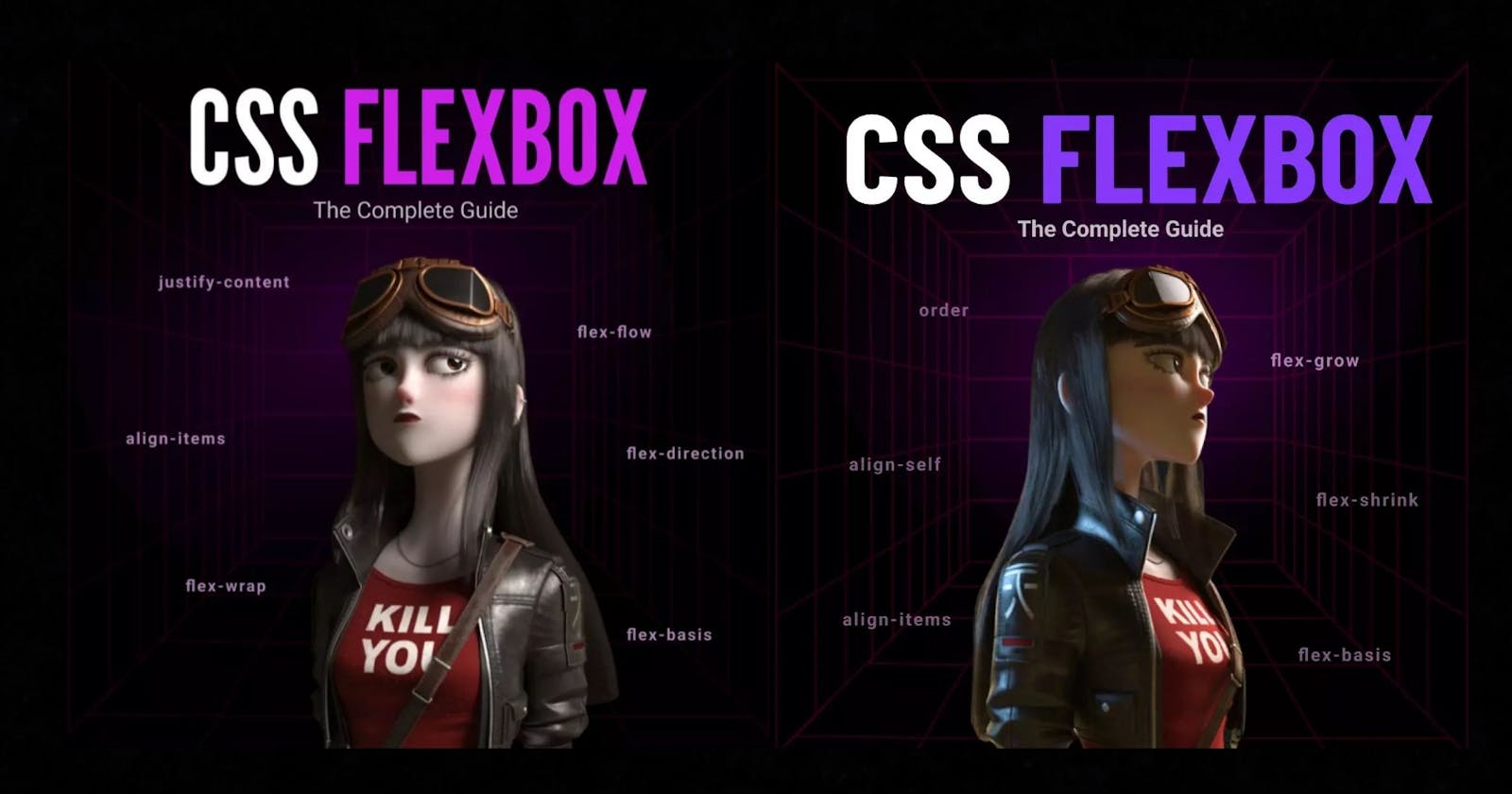
- PART - I
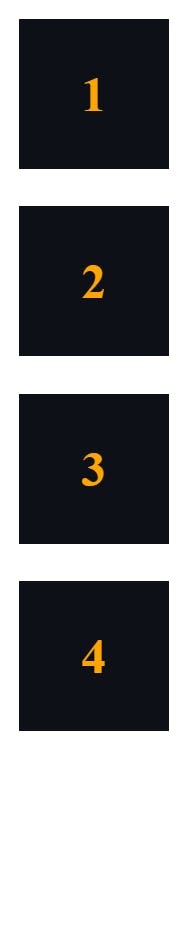
- - PART - II
- Do you find it helpful? 🤗
Flexbox is a one-dimensional layout system that we can use to create a row or a column axis layout.
👉🏻Properties of flexbox:-
PART - I
🔥1. flex-direction:-
row(default)row-reversecolumncolumn-reverse
🔥2. flex-wrap:-
nowrap(default)wrapwrap-reverse
🔥3. flex-flow :-
This is a shorthand for the flex-direction and flex-wrap properties
🔥4. justify-content:-
flex-start(default)flex-endstartendleftrightcenterspace-betweenspace-aroundspace-evenly
🔥5. align-items:-
flex-start / start / self-startflex-end / end / self-endcenterbaseline
FELXBOX
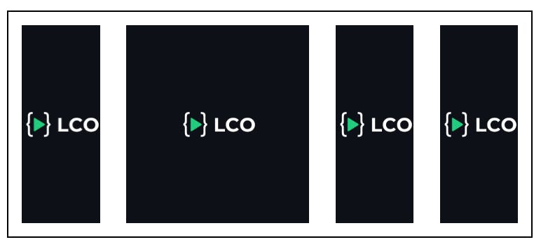
To use flexbox we will use the display property.
Let's first see the OUTPUT without flex.
HTML ->
<body>
    <div class="box"><img src="./logo.svg" alt="Lco Logo" /></div>
    <div class="box"><img src="./logo.svg" alt="Lco Logo" /></div>
    <div class="box"><img src="./logo.svg" alt="Lco Logo" /></div>
    <div class="box"><img src="./logo.svg" alt="Lco Logo" /></div>
</body>
CSS ->
.box {
  width: 120px;
  height: 120px;
  background-color: #0d1117;
  margin: 15px;
  display: grid;
  place-items: center;
}
OUTPUT ->

Now let's use display: flex; property on the parent container
body {
  display: flex;
}

✅ flex-direction:
HTML ->
  <body>
    <div class="box">1</div>
    <div class="box">2</div>
    <div class="box">3</div>
    <div class="box">4</div>
  </body>
CSS ->
body {
  display: flex;
  flex-direction: row | column | row-reverse | column-reverse;
}
➡️ flex-direction: row;

⬅️ flex-direction: row-reverse;

⬇️ flex-direction: column;
⤴️ flex-direction: column-reverse;
✅ felx-wrap:
🎁flex-wrap: wrap;
body {
  display: flex;
  flex-wrap: wrap;
}

.box:nth-child(2) {
  width: 300px;
}
🎁 flex-wrap: nowrap;

🎁 flex-wrap: wrap-reverse;
✅ flex-flow:
This is a shorthand for the flex-direction and flex-wrap properties together.
body {
  display: flex;
  flex-flow: column wrap;
}
✅ justify-content:
body {
  display: flex;
  justify-content: flex-start | flex-end | center | space-between | space-around | space-evenly;
}
🚀 justify-content: flex-start;

🚀 justify-content: flex-end;

🚀 justify-content: center;

🚀 justify-content: space-between;

🚀 justify-content: space-around;

🚀 justify-content: space-evenly;

✅ align-items:
.container {
  width: 600px;
  height: 260px;
  margin: 2rem;
  border: 2px solid black;
  display: flex;
  align-items: stretch | flex-start | flex-end | center | baseline;
}
📢 align-items: flex-start;
📢 align-items: flex-end;
📢 align-items: center;

📢 align-items: stretch;
📢 align-items: baseline;

- PART - II
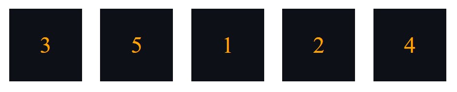
🔥1. ORDER:
🔥2. FLEX-GROW:
🔥3. FLEX-SHRINK:
🔥4. FLEX-BASIS:
🔥5. ALIGN-SELF:
✅ ORDER PROPERTY
Output without applying order property ::
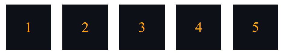
.box:nth-child(1) {order: 3;}
.box:nth-child(2) {order: 4;}
.box:nth-child(3) {order: 1;}
.box:nth-child(4) {order: 5;}
.box:nth-child(5) {order: 2;}
Output after applying order property ::
✅ FLEX-GROW
Output without applying felx-grow property ::
.box:nth-child(1){flex-grow: 1;}
.box:nth-child(2){flex-grow: 1;}
.box:nth-child(3){flex-grow: 2;}
.box:nth-child(4){flex-grow: 1;}
.box:nth-child(5){flex-grow: 1;}
Output after applying flex-grow property ::

✅ FLEX-SHRINK
Output without applying felx-shrink property ::

.box:nth-child(1) {
  flex-grow: 1;
  flex-shrink: 1;
}
.box:nth-child(2) {
  flex-grow: 1;
  flex-shrink: 1;
}
.box:nth-child(3) {
  flex-grow: 1;
  flex-shrink: 2;
}
.box:nth-child(4) {
  flex-grow: 1;
  flex-shrink: 1;
}
.box:nth-child(5) {
  flex-grow: 1;
  flex-shrink: 1;
}
Output after applying flex-shrink property ::

✅ FLEX-BASIS
Output without applying felx-basis property ::

.box:nth-child(1) {
  flex-grow: 1;
  flex-shrink: 1;
}
.box:nth-child(2) {
  flex-grow: 1;
  flex-shrink: 1;
}
.box:nth-child(3) {
  flex-grow: 1;
  flex-shrink: 2;
}
.box:nth-child(4) {
  flex-grow: 1;
  flex-shrink: 1;
}
.box:nth-child(5) {
  flex-grow: 1;
  flex-shrink: 1;
}
Output after applying flex-basis property ::

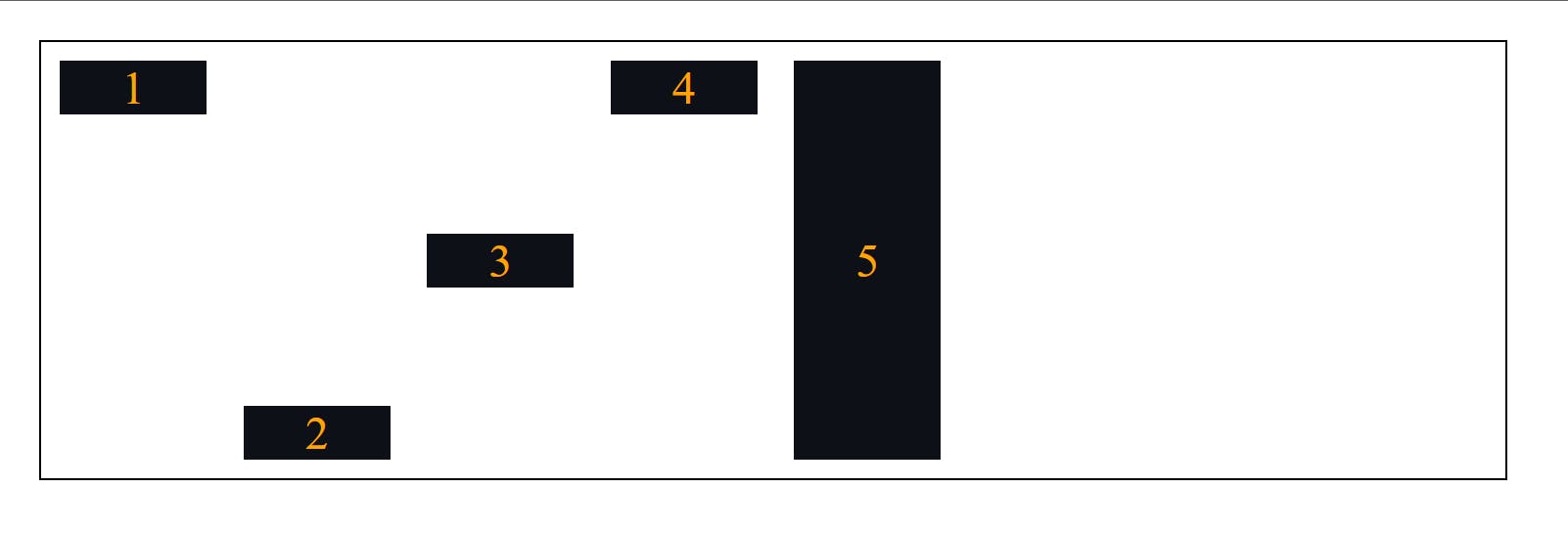
✅ ALIGN-SELF
Using the align-self property we can place an individual item inside the parent container.
.box:nth-child(1) { align-self: flex-start; }
.box:nth-child(2) { align-self: flex-end; }
.box:nth-child(3) { align-self: center; }
.box:nth-child(4) { align-self: baseline; }
.box:nth-child(5) { align-self: stretch; }
Do you find it helpful? 🤗
Let me know in the comments. 🙋♂️
CSS Grid Comming Soon 🔜
Follow me on Instagram -> Abhishek Patil